
CSS Grid tutorial to finally get it down, once and for all
Up until recently, I only ever came across using the grid CSS property on an adhoc basis. With enough StackOverflow and Ctrl+C Ctrl+V, I was able to build something up that kind of satisifed my visual hunger.
I never got around to properly learning and understanding it. I thought I wouldn’t feel guilty about it either.
Boy.
I was wrong.
The problem was when I wanted to change the layouts. I didn’t know how. I was back to StackOverflow, searching up the most basic concepts over and over again.
I wasn’t growing.
Lucky for me, I attended a CSS Workshop at Chrome Dev Summit last week, and I picked up some fundamentals
If you’d like to get hands-on, here is the full codepen list from Rachael Andrew. My learnings are from this codepen.
Table of Contents
Basic manual placement
grid-template-columns
repeat
auto-fit
minmax()
Line-based placement
grid-auto-rows
item-specific layouts
Auto-placement
nth-child()
grid-auto-flow
Named lines
Multiple lines with the same name
Named grid areas
Lines from named areas
Areas from named lines
Basic manual placement
Let’s start off by simply setting our display to grid.
.container {
  display: grid;
}Everything is all in one single column! Let’s try to divide it into multiple columns.
grid-template-columns
To start things off, let’s define grid-template-columns to specify three columns.
.container {
  display: grid;
  grid-template-columns: 100px 100px 100px;
  grid-gap: 20px;
}
Here, I’m defining 3 columns, inside my grid, each 100px wide. That’s why I repeated 100px three times.
I also added a gap with grid-gap for minor visual esthetics.
repeat()
You know what, repeating 100px 3 times feels silly.
Let’s use repeat().
.container {
  display: grid;
  grid-template-columns: repeat(3, 100px);
  grid-gap: 20px;
}
Here, I’m telling my browser to repeatedly define a 100px column 3 times. The result is exactly the same.
repeat() and more
You know what, the third element needs more space than other elements. Let’s define a separate width for the 3rd column.
.container {
  display: grid;
  grid-template-columns: repeat(2, 100px) 300px;
  grid-gap: 20px;
}
We are defining two columns 100px wide, then a 300px wide column.
It’s equivalent to
.container {
  display: grid;
  grid-template-columns: 100px 100px 300px;
  grid-gap: 20px;
}auto-fit
Okay now we have more space for the 3rd column, but I’m still not happy with our grid.
It doesn’t dynamically scale to the window size. No matter how small or big I expand my window, there are always 3 columns.
Let’s fix that with auto-fit.
.container {
  display: grid;
  gap: 20px;
  grid-template-columns: repeat(auto-fit, 100px);
}
We are basically telling our browser to fit in as many non-empty columns as much as possible. This makes the browser render enough columns so that they fit into the window.
I say non-empty because
auto-fillwill fit in as many columns as possible, even if they are empty. But that’s not a detail we need to go into right now 🤫.
Now the number of columns will vary depending on your window size.
If you are on desktop, open the codepen in a new window and try expanding / shrinking the window and see how it changes the grid.
minmax()
But we still have a problem. When we have a huge window, there is a lot of unused empty space. How can we get our columns to eat up that empty space?

Let’s use minmax() along with flex, aka fr units.
.container {
  display: grid;
  grid-template-columns: repeat(auto-fit, minmax(100px, 1fr));
  grid-gap: 20px;
}
Let’s break this down.
With 1fr, we are basically saying something like “spread out my columns evenly to fill up any unused space.”.
With minmax(100px, 1fr), we are simply setting a min and a max width. In our case, the width should be at a minimum of 100px, and a maximum of 1fr.
Meaning, that we want the columns to expand and eat up any empty space, but in the event the browser window gets too small, we want our columns to be at least 100px, no matter what.

It will also dynamically adapt to the available width.
Line-based placement
Let’s say we are developing CSS for a client who has a very irregular request:
Request: 1st element should be located in the second row, and take up two columns in width.
grid-auto-rows
First, let’s define our container.
.container {
  display: grid;
  grid-template-columns: repeat(auto-fit, minmax(100px, 1fr));
  grid-auto-rows: minmax(100px, auto);  gap: 20px;
}
What’s new? grid-auto-rows. We are basically telling our browser to create rows as necessary, with a min height of 100px, or fit-to-content (auto).
item-specific layouts
Let’s add an id to our first item.
<div class="item" id="one">One</div>And the css.
#one {
  grid-row: 2 / 3;
  grid-column: 1 / 3;
}
Don’t let the divider scare you off! It’s really simple. The syntax is like:
grid-row: // begin-index of the row line / end-index of the row lineWe are simply telling our browser to make our element take up space between column lines 1-3, and rows 2-3.

Our client makes another peculiar request. He wants the second element to take up the entire first row.
We can add the following CSS
#two {
  grid-column: 1 / -1;
}
A negative index can be used to offset from the other end of the columns.
Just when we thought it was over, the client is asking us to have our 3rd element take up first two rows, and to have the first element appear on top of the third.
So, we add the following CSS.
#three {
  grid-row: 1 / 3;
}
But alas, here is what we get.

Our 2nd element is no longer in the first row, and 3rd and 5th element are moved out to the third row!
This is because our browser is dynamically setting any column / row properties that aren’t specified.
We need to get more specific…
#three {
  grid-row: 1 / 3;
  grid-column: 3 / 4;
}

#two {
  grid-column: 1 / -1;
  grid-row: 1 / 2;
}
And we will get:

Only problem? The client wants the 2nd element to block the 3rd element.
#three {
  grid-row: 1 / 3;
  grid-column: 3 / 4;
  z-index: -1;}

#two {
  grid-column: 1 / -1;
  grid-row: 1 / 2;
  background-color: white;}
z-index sets the ordering of elements, and setting it to -1 means we want it behind other elements in our case.
We needed to add background-color because otherwise the 3rd element would be seen through the 2nd element.
Now we will get:

Auto-placement
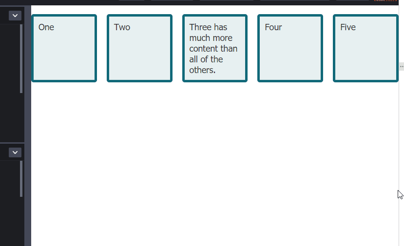
A couple days go by and our client comes back. This time, he once again wants a grid with a bunch of elements of certain sizes, but he doesn’t need them in any specific location. All he needs is a guarantee of each element’s sizing.
He wants the 1st element to span 1 column and 2 rows. And every even element should span 1 row and 2 columns.
We go back to our classic container.
 <div class="container">
    <div class="item">One</div>
    <div class="item">Two</div>
    <div class="item">Three has much more content than all of the others.</div>
    <div class="item">Four</div>
    <div class="item">Five</div>
</div>
We define our container css:
.container {
  display: grid;
  grid-template-columns: repeat(auto-fit, minmax(200px, 1fr));
  grid-auto-rows: minmax(100px, auto);
  grid-gap: 20px;
}
nth-child()
CSS for the 1st child:
.container :nth-child(1) {
  grid-row: auto / span 2;
}
:nth-child() basically applies css only to the child of the DOM element at the specified index.
auto / span <integer>
Let’s break this down.
.container :nth-child(1) {
  grid-row: auto / span 2;}
Here auto means we are letting the browser automatically figure out where to place this. span 2 means we want it to span 2 columns. Check out the docs for reference.
Now, we will apply a similar CSS for even children.
.container :nth-child(even) {  grid-column: auto / span 2;
}
This works, because even is a keyword and :nth-child(even) will pick up all children whose index is even.
So we will get the following, but see a problem right away:

grid-auto-flow: dense
We can fix this with grid-auto-flow: dense in our .container.
.container {
  display: grid;
  grid-template-columns: repeat(auto-fit, minmax(200px, 1fr));
  grid-auto-rows: minmax(100px, auto);
  grid-gap: 20px;
  grid-auto-flow: dense;}
grid-auto-flow controls how to auto-placement works, and setting it to dense basically tells our browser to ignore the ordering of elements and just fill up empty spaces. Docs.
So, we will get

Named lines
Instead of using span or line indexes to define grid cell sizes, we could also put variable names on our lines.
Let’s define some names on our lines.
.container {
  display: grid;
  grid-template-columns: [container-start] 1fr [mark] 1fr 1fr 1fr [container-end];  grid-auto-rows: minmax(100px, auto);
  grid-gap: 20px;
  grid-auto-flow: dense;
}
Here is a visualization.

We can then use those names on elements.
.container :nth-child(1) {
  grid-column: container-start / container-end;}
We will get this:

Duplicate names
Imagine your cat came to you to ask a question.

In that case, we’d use a number to specify which one to use, like grid-column: mark 2 / mark 3.
Here’s an example.
Here’s our container.
.container {
  display: grid;
  grid-template-columns: repeat(2, [sm] 1fr [lg] 2fr) 1fr;
  grid-auto-rows: minmax(100px, auto);
  grid-gap: 20px;
  grid-auto-flow: dense;
}
We are basically defining [sm] 1fr [lg] 2fr [sm] 1fr [lg] 2fr 1fr.
To make an element span from the first sm to the second sm, we can write:
.container :nth-child(1) {
  grid-column: sm / sm 2;
}Named grid areas
I personally think this is really cool, but haven’t had a use-case for it in my projects yet.
It’s easier to just show it than explain it. So here it is:
Container:
.container {
  display: grid;
  grid-template-columns: 1fr 1fr 1fr 1fr ;
  grid-auto-rows: minmax(100px, auto);
  grid-template-areas:    "hd hd hd .."    "sd bd bd .."    "sd ft ft ft";  gap: 20px;
}
We can now assign our elements to these named areas.
.container :nth-child(1) {
  grid-area: hd;
}
Which will look like:

You can set other elements as well:
.container :nth-child(2) {
  grid-area: sd;
}

.container :nth-child(3) {
  grid-area: bd;
}

.container :nth-child(4) {
  grid-area: ft;
}
Which will look like:

Lines from Named Areas
Going off our previous example, let me illustrate how we can use -start and -end suffixes on our named areas.
Let’s keep our container from above, and update our first element:
.container :nth-child(1) {
  grid-row: hd-start / bd-end;  grid-column: sd-end / bd-end;  background-color: white;
  z-index: 1;
}
And we get this:

To understand this, I highly recommend playing around on the Codepen:
⚠️ Notice how the same variable like
bd-endwill be different forgrid-rowandgrid-column!!
Areas from Named Lines
Just like how we can use lines on named areas, we can use areas on named lines.

Let’s define our container with named lines.
.container {
    display: grid;
    grid-template-columns: 1fr [box-start] 1fr 1fr [box-end] 1fr ;
    grid-template-rows: 200px [box-start] 200px [box-end] 200px;
    gap: 20px;
}
This is what we’d get normally:

Let’s use the box-start box-end line names and get an area from it. Simply remove the -start and -end suffixes.
.container :nth-child(1) {
  grid-area: box;
}
And now we get:

Hope this was helpful. Any feedback? Send it to dougouk@gmail.com.
Remember, the key to learning CSS is playing around with it. Fork stuff from Rachel Andrew's codepen and play around with the CSS.
Happy programming!