
CSS Flex Ramp Up
Ever wanted to flex off your CSS skills but never got around learning it properly?
Well then, this guide is for you to flex 💪
The learnings in this post are coming from Rachel Andrew's Codepen
Table of Contents
Playground Setup
Flex
flex-direction
flex-wrap
flex
syntax
Alignment
Quick-notes
Relative properties
Playground Setup
You can skip the setup and go straight to the next section if you just wanna read along.
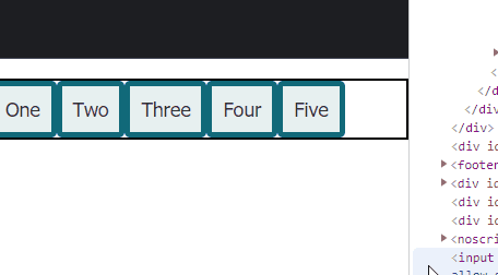
Let’s add some elements to our HTML.
<div class="container">
    <div class="item">One</div>
    <div class="item">Two</div>
    <div class="item">Three</div>
    <div class="item">Four</div>
    <div class="item">Five</div>
</div>
And put in some CSS to make them look bearable.
* { box-sizing: border-box; }

body {
    font: 1.1em/1.3 Tahoma, Verdana, Segoe, sans-serif;
    background-color: #fff;
    color: #333;
    max-width: 760px;
    margin: 1em auto;
}

.item {
    padding: 10px;
    border: 5px solid rgb(17, 105, 121);
    background-color: rgba(17, 105, 121,.1);
    border-radius: 5px;
}
No need to understand those, as they aren’t really what this post is about. We are just making them look like this
Flex
Let’s set up our container with display set to flex.
.contaier {
  display: flex;
}
Nothing really changed in our UI.

flex-direction
Let’s make the elements appear in a column inside of a row.
.container {
  display: flex;
  flex-direction: column;
}
Now we get a column.

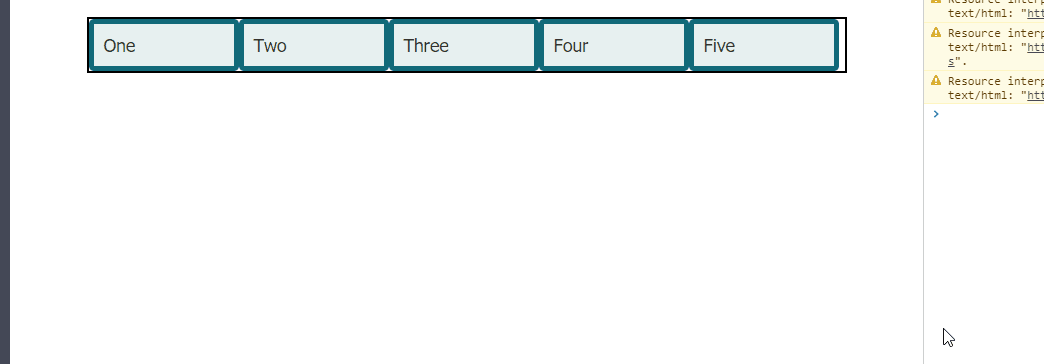
flex-wrap
Instead of making it entirely a row or a column, let’s try to make the elements wrap around dynamically.
.container {
  display: flex;
  border: 2px solid black;
  flex-direction: row;
  flex-wrap: wrap;}
This will allow our elements to be wrapped.
flex: <‘flex-grow’> <‘flex-shrink’> <‘flex-basis’>
Now, let’s apply flex to our item class.
You might want to play around with this part in the codepen to get the hang of it.
.item {
  flex: 0 1 150px;
}
We are basically doing the following:
flex-growis0, meaning the elements will not expand to fill up empty space.flex-shrinkis1, meaning all the items will shrink appropriately as the width of the parent gets smallerflex-basisis set to150px, meaning the element should start at150pxbefore space is evenly distributed among the elements.
flex-growandflex-shrinkare relative properties, meaning elements with a higher value will expand more relative to other elements.
So we will get the following:
Also notice this:

Let’s set 1 to flex-grow.
.item {
  flex: 1 1 150px;
}
Then we will get the following:

To become a master at flexing, I recommend checking out the docs and playing around on the Codepen (fork mine or something).
Syntax
Few notes about flex.
- one-value syntax like
flex: <num>will result inflex: <num> 1 0; - avoid two-value syntax cuz it’s confusing
- there are also other shorthand values like
initial,auto,noneinitialis equal to0 1 autoautois equal to1 1 autononeis equal to0 0 auto
- usually, the shorthand or the one-value syntax is more commonly used instead of the two and three-value syntax
Alignment
You get a huge variety of alignment options with flex. Instead of writing about it, I just wanted to guide you to this useful doc. Check it out and play around on Codepen. Here is one from Rachel Andrew.
Quick Notes
justify-content- align content along the main axis (
flex-direction)
- align content along the main axis (
align-items- align content along the cross-axis (perpendicular to
flex-direction)
- align content along the cross-axis (perpendicular to
align-content- manage how content aligns when there is extra space in the parent container. Aligns along the cross-axis.
align-self- override the cross-axis alignment on individual elements
Relative properties
In the flex section I mentioned “relative properties”. This means that elements will take up space relative to other elements based on their grow / shrink values.
Let’s say that we want to give our first div a lot more growth space than the others.
We can acheive this by giving our first element a higher value of flex-grow than the other items.
.container :nth-child(1) {
  flex: 3 /* 3 1 auto */
}

.item {
  flex: auto; /* 1 1 auto*/
}


That’s all. Hope you learned something. Happy coding!