CSS for multiple browsers! Fallbacks tutorial
Question for you: which browser are you reading this on right now?
I use chrome most of the time. In fact, I rarely think about using a different browser. And hence, I only tested my blog on chrome.
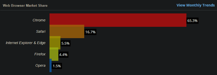
But a quick look at the W3Counter's Browser Market Share shows that 34.7% of users worldwide don’t use Chrome.
That’s a lot of people.
So the topic for today is this: Is your CSS inclusive enough?
Unsupported CSS
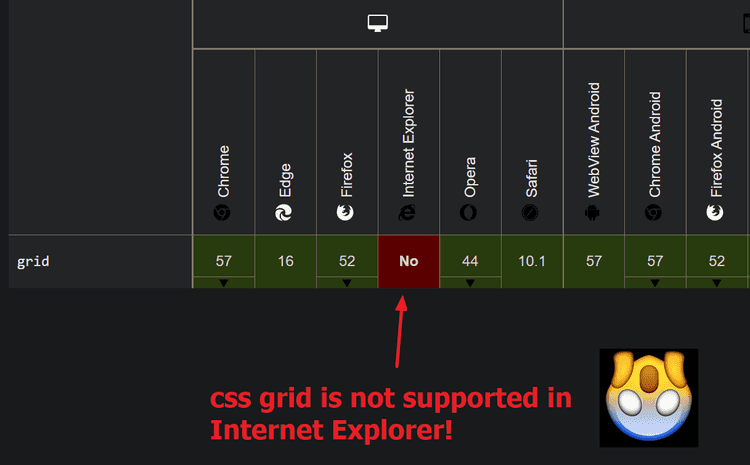
If you are a front-end developer, you probably already know how different browsers support different Web APIs. CSS is no different. For example, CSS grid is not supported in Internet Explorer.
If you make an amazing website using CSS grid features, good job! But if you don’t have browser fallbacks, it might not look so great for Internet Explorer users.
Browser fallback: back-up CSS styles that a browser can use if it cannot support specified CSS features
Workarounds
normalize.css is a pretty popular workaround for this.
Eric Meyer's CSS Reset is also pretty popular.
But this post isn’t about using those.
This post is about helping you learn how to develop your own CSS components that have fallbacks just in case.
Basic Fallback
Suppose you want to use grid, but you don’t want to leave out those poor Internet Explorer fellows.
Let’s create a basic fallback for them.
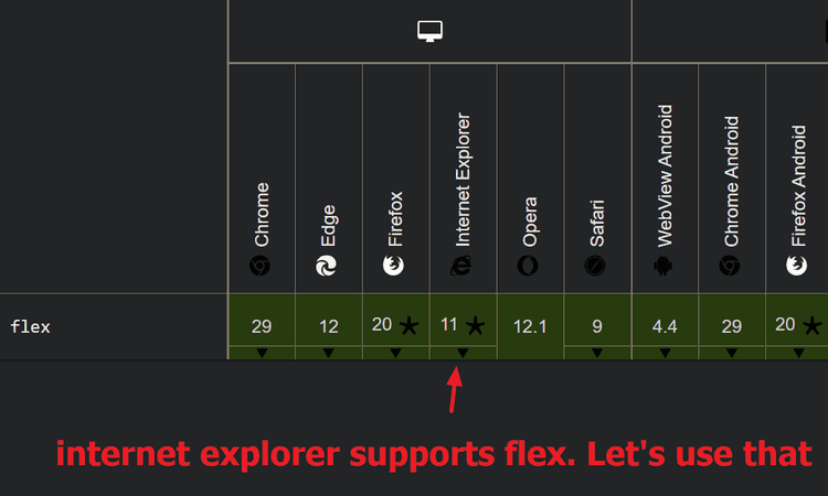
From the MDN docs, we can see that Internet Explorer supports flex.
So, let’s use flex as our fallback.
.container {
  display: flex;
  align-items: center;
  display: grid;
  grid-template-columns: 1fr 1fr 1fr;
}
Here is an explanation:
/* browser reads from top to bottom, and applies the most-recently read CSS */
.container {
  display: flex; /* IE will apply this, and then... */
  align-items: center;
  display: grid; /* IE will try to apply this, fail, and end up keeping display: flex */
  grid-template-columns: 1fr 1fr 1fr;
}
Now, that works… But your code quality might suffer if you write code like that.
Therefore I introduce to you: feature queries!! 🎉🎊
Feature Queries
Feature queries are the way to go. It helps you write modular CSS components.
Here is what the code looks like with feature queries:
@supports (display: flex) {
  .container {
    display: flex;
    align-items: center;
  }
}

@supports (display: grid) {
  .container {
    display: grid;
    grid-template-columns: 1fr 1fr 1fr;
  }
}
It’s probably not necessary to wrap display: flex within its own feature query, but I think it makes the code more readable.
Here is the @supports documentation link.
That’s all! Hope you learned something. Happy programming!


